Color Trends in Interior Design and Home Staging 2021
Due to the global pandemic and lockdown, several businesses suffered a setback. So did interior design and home staging as most projects were put on hold. But in 2021 interior design and home staging across the US is back with renewed color and styles to spread cheer for homeowners and realtors. Home interiors are ready to herald the new 2021.
Color can make or break an interior designed or staged home. Hence, the top interior design companies in US and the best home staging companies have professionals who not only understand the significance of color but also keep abreast with color trends to stay on top of their game.
Color in any home plays an important role in how we relate to every room. Color affects not just the overall look but also the feel of the home. Since color affects the mood—it is extremely important to choose base colors and accent colors carefully. An understanding of the color wheel also helps to combine the right colors and hues to create the WOW factor.
Here are a few happy color ideas for home interiors:
In the living room
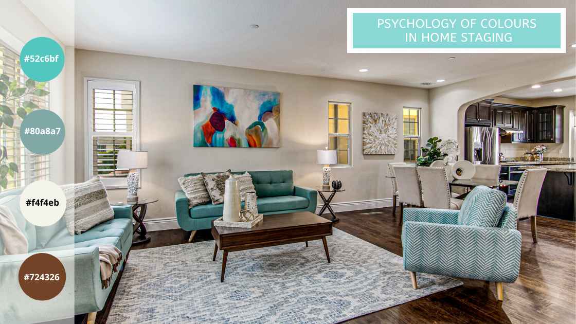
A living room is a space where family and friends come together to meet, greet, and entertain. Most designers prefer the basic color of the room to be painted white or ivory or beige and use bright accent pieces in happy colors like yellow, gold, teal, turquoise to add a friendly touch.
In the bedroom
A happy bedroom is one that induces sleep. It has to be calming and restful. Therefore, muted tones like blush, sky blue, and light grey are preferred.
In the dining room
A dining room is where people enjoy their meals. Since colors like red increase the appetite, it is often found in dining areas. Even sophisticated colors like crimson, navy blue, jade green bring happy vibes to a dining area.
In the kitchen
Any bold and playful shades are good for a kitchen. It’s only important that the color blends in or contrasts countertops, cabinets, and backsplash accent tiles. Painting the center island in any bright color can also become an eye-popper while the rest of the kitchen is in a warm neutral tone.
In the bathroom
In home staging, bathrooms don’t leave much scope to change. The stager only uses accent colors to highlight the tiles and vanity in the bathroom. It is the job of the interior designer to get it right.
In the foyer
Some homes have a foyer or a stairwell at the entrance. The interior designer or home stager will always prepare this entryway to welcome owners/potential buyers. From colorful fresh flowers to a painting on the wall to a bright rug or console, the foyer can use bright accents with neutral wall coloring or vice versa a bright color on the wall with subdued accent pieces.
Now that we know home interiors do need different colors to enliven the space, getting the right look with the right color, is very important. It is the time of the year when major paint companies have begun to showcase their top colors and palettes for 2021. From warm, to comforting and clean, here are a few color trends expressed for 2021: –
1. Sherwin-Williams Hottest Colors 2021: Urbane Bronze
The Sherwin-Williams theme 2021 is Rhythm. The colors provide a sense of balance through 40 trend colors presented in four palettes – Sanctuary, Encounter, Continuum, Tapestry. While all these colors draw from nature to render a rhythm of beautiful life, their hottest color 2021 is Urbane Bronze, SW 7048 (245-C7). It embodies the richness of the Earth’s stone, metal, and wood — forging a feeling that’s grounded, meditative and serene.
2. PPG Hottest Colors 2021: ‘Be Well’ Palette
For PPG ‘Be Well’ is the 2021 Palette of the Year. It’s softened hues support mental and physical well-being. According to Dee Schlotter, PPG senior color marketing manager, architectural and industrial coatings. “This organic and hopeful palette represents what we have been longing for after decades of overstimulation and overconsumption – simplicity and restfulness.” The Be Well palette trio consists of Transcend, an oatmeal color hue (PPG1079-4), Big Cypress, a shaded ginger with persimmon undertones (PPG 1062-5), and Misty Aqua, a watercolor cerulean blue (PPG 1147-3).
3. Behr Hottest Colors 2021: Six themes, 21 hues
The Behr color trends 2021 palette is a curated selection of 21 hues. Their themes include Casual Comfort – light warm neutrals, Calm Zone – restorative blues and greens, Subtle Focus – soft gentle hues, Quiet Haven – rich evocative colors, Optimistic View – bold and saturated, Outdoor Escape – easy curbside appeal.
4. Benjamin Moore 2021 Hottest Colors 2021: Aegean Teal
The Benjamin Moore Color of the Year 2021, Aegean Teal 2136-40, is aimed to create natural harmony. The intriguing, balanced, and deeply soothing twelve hues in the palette radiate warmth and wellbeing. These are colors are curated to make the home feel even more like home and settled in.
5. Valspar Hottest Colors 2021: 12 shades
Valspar’s 12 shades of fresh and familiar colors are trendy and all about making you feel cozy and comfortable. These colors are created with a sense of calm associated with the words meditation” and “home improvement” after the stress related to the global pandemic of 2020.
6. Glidden Hottest Colors 2021: Aqua Fiesta
Glidden’s 2021 paint color prediction for the first time includes an accent color, Aqua Fiesta. Aqua Fiesta PPG1147-4 is a part of the blue-green family which denotes a bright and refreshing start to 2021. The color choice for an accent wall, paneling or, fireplace is best combined with neutral colors for bedrooms and living rooms. Glidden suggests combining pairing Aqua Fiesta with a cool grey to create a spa-like vibe for bathrooms.
7. Rust-Oleum Hottest Colors 2021 – Satin Paprika
At Rust-Oleum, Satin Paprika is at the color 2021. This is selected from its10 thoughtfully curated options placed under three distinct palettes signifying warmth, comfort, calm, and relaxation. The earthy, spicy hue called Satin Paprika belongs to one of its three palettes – Outdoor Living. Warm and cozy, the red color accompanies other trending shades from its Modern Bohemian and Mid-Century Chic palettes. The company suggests spraying a few coats of Satin Paprika on accent furniture like a centre table, cabinet, or lampshade base combining with earthy tones.
8. Pantone Hottest Colors 2021: Ultimate Grey and Yellow Illuminating
“It’s a combination that speaks to the resilience, the optimism and hope and positivity that we need, as we reset, renew, reimagine and reinvent,” said Laurie Pressman, vice president of the Pantone Color Institute, in a video call along with executive director, Leatrice Eiseman. Further to their press statement, Illuminating is associated with optimism and vivacity, while Ultimate Gray encourages “feelings of composure, steadiness and resilience.” These colors have been chosen to soothe, calm, and uplift.
Décor colors for 2021 emote the new normal. With best interior design teams and real estate stagers now using colors of 2021 to design luxury interiors, we can look forward to healthier and happier homes in 2021.
